How to Choose a Colour Palette for a Living Room That Feels Finished
Living room colour works best when it has structure: a base, a bridge, an accent and a small moment of contrast.
Palette Burst helps you move from “I like this colour” to “this colour works”. Start with a single shade, explore harmonies, test contrast, compare real-world palettes, and build colour systems for interiors, fashion, brands, websites, teams, flags, paints and creative projects.
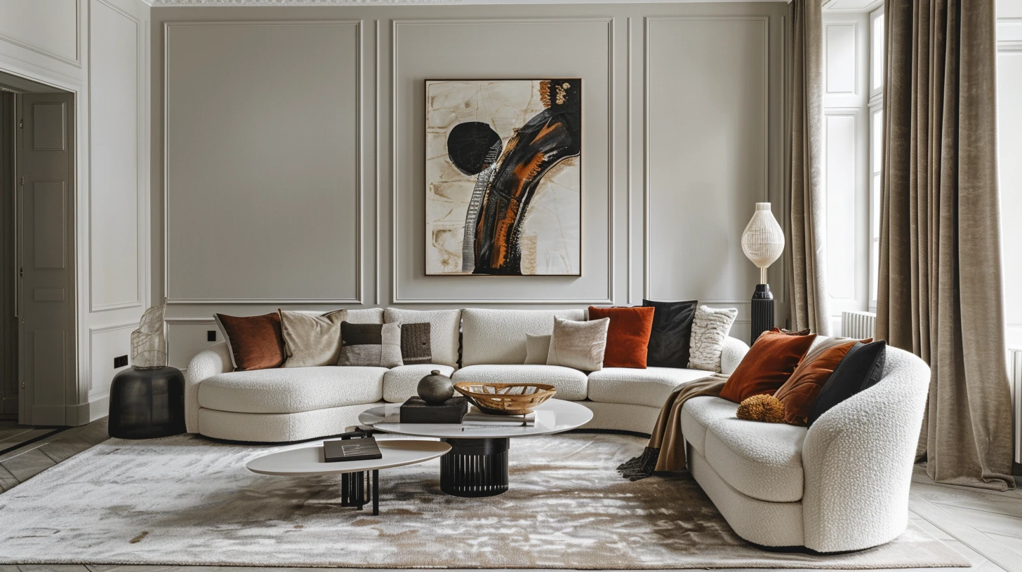
Living room colour works best when it has structure: a base, a bridge, an accent and a small moment of contrast.
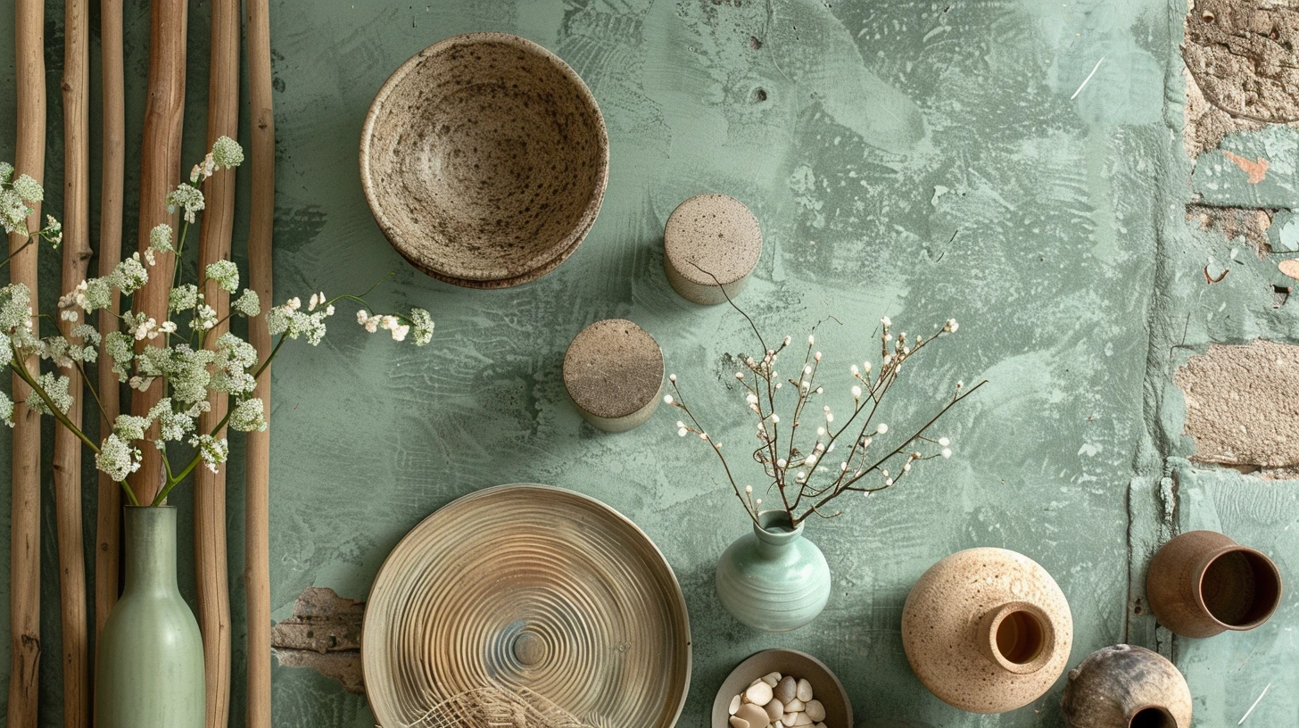
Article idea exploring forest, ocean, desert, garden and sunset-inspired colour palettes for interiors and creative projects.
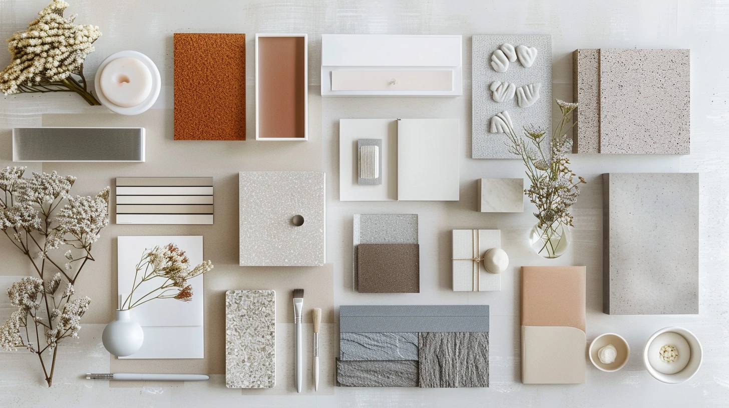
Article idea helping small businesses choose brand colours for websites, logos, packaging and social media.
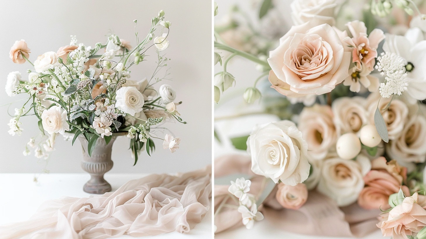
Article idea featuring elegant wedding colour schemes including blush, sage, champagne, navy, gold, ivory and terracotta.

Explore every 2026 World Cup country as a visual colour palette, with flag-inspired colour cards, hex codes and practical design notes.
Browse the largest set of wall colours, accent shades and practical paint combinations in the database.
Explore brand-inspired colour systems for mood boards, visual research and creative direction.
Browse different types of schemes, from sport and seasonal ideas to editorial, wellness, luxury and digital projects.
Explore schemesExplore individual colours such as sage, navy, terracotta, burgundy, lavender, gold, green, blue and more.
Explore coloursFind palettes for living rooms, bedrooms, kitchens, bathrooms, hallways and practical decorating ideas.
Explore interiorsPlan capsule wardrobes, seasonal outfits, quiet luxury looks and everyday colour combinations.
Explore fashionDiscover sports team palettes across football, basketball, baseball, American football and Formula 1.
Explore teamsBrowse country and flag colour schemes for events, campaigns, posters and themed design work.
Explore flagsWarm White Paint colour palette inspiration for design, styling and creative projects.
View palette →Soft White Paint colour palette inspiration for design, styling and creative projects.
View palette →Chalk White Paint colour palette inspiration for design, styling and creative projects.
View palette →Alabaster Paint colour palette inspiration for design, styling and creative projects.
View palette →Swiss Coffee Inspired Paint colour palette inspiration for design, styling and creative projects.
View palette →Ivory Paint colour palette inspiration for design, styling and creative projects.
View palette →Linen Paint colour palette inspiration for design, styling and creative projects.
View palette →Parchment Paint colour palette inspiration for design, styling and creative projects.
View palette →Alabaster paint colour inspiration for interiors, walls, accents and decorating schemes.
View palette →Beige paint colour inspiration for interiors, walls, accents and decorating schemes.
View palette →Ivory paint colour inspiration for interiors, walls, accents and decorating schemes.
View palette →Linen White paint colour inspiration for interiors, walls, accents and decorating schemes.
View palette →Dove Grey paint colour inspiration for interiors, walls, accents and decorating schemes.
View palette →Eggshell paint colour inspiration for interiors, walls, accents and decorating schemes.
View palette →Greige paint colour inspiration for interiors, walls, accents and decorating schemes.
View palette →Pewter paint colour inspiration for interiors, walls, accents and decorating schemes.
View palette →Red colour palette ideas for interiors, fashion, branding, websites and creative projects.
View palette →Warm Grey colour palette ideas for interiors, fashion, branding, websites and creative projects.
View palette →Blue colour palette ideas for interiors, fashion, branding, websites and creative projects.
View palette →Cool Grey colour palette ideas for interiors, fashion, branding, websites and creative projects.
View palette →Green colour palette ideas for interiors, fashion, branding, websites and creative projects.
View palette →Mushroom colour palette ideas for interiors, fashion, branding, websites and creative projects.
View palette →Putty colour palette ideas for interiors, fashion, branding, websites and creative projects.
View palette →Yellow colour palette ideas for interiors, fashion, branding, websites and creative projects.
View palette →