Greige Colour Palettes for Homes That Need Warmth and Balance
Greige works because it sits between grey and beige, giving a room softness without losing structure.
Practical colour guides for rooms, outfits, brands and digital design. Explore palettes, combinations, colour psychology and real-world inspiration you can use straight away.
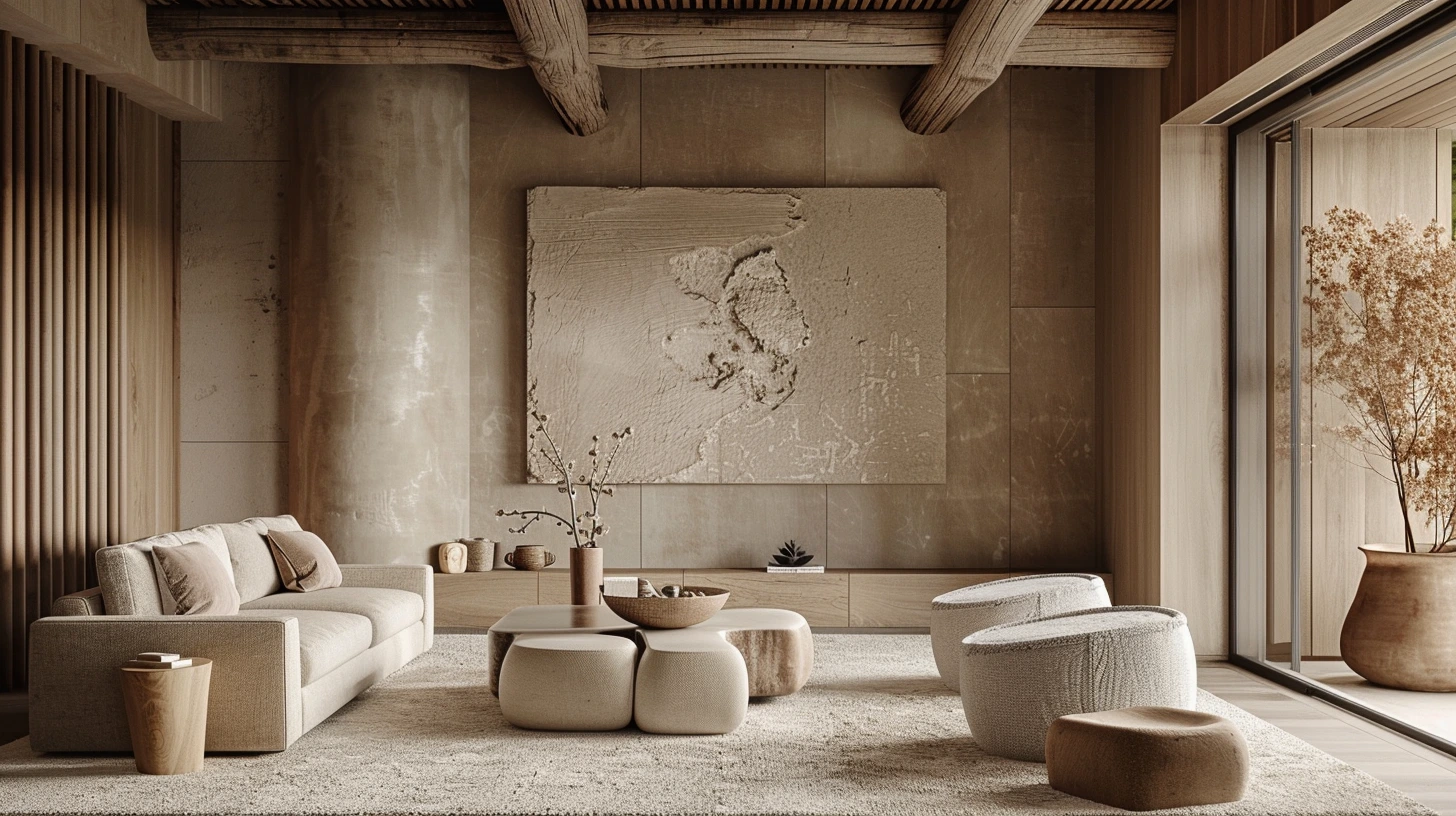
Greige works because it sits between grey and beige, giving a room softness without losing structure.
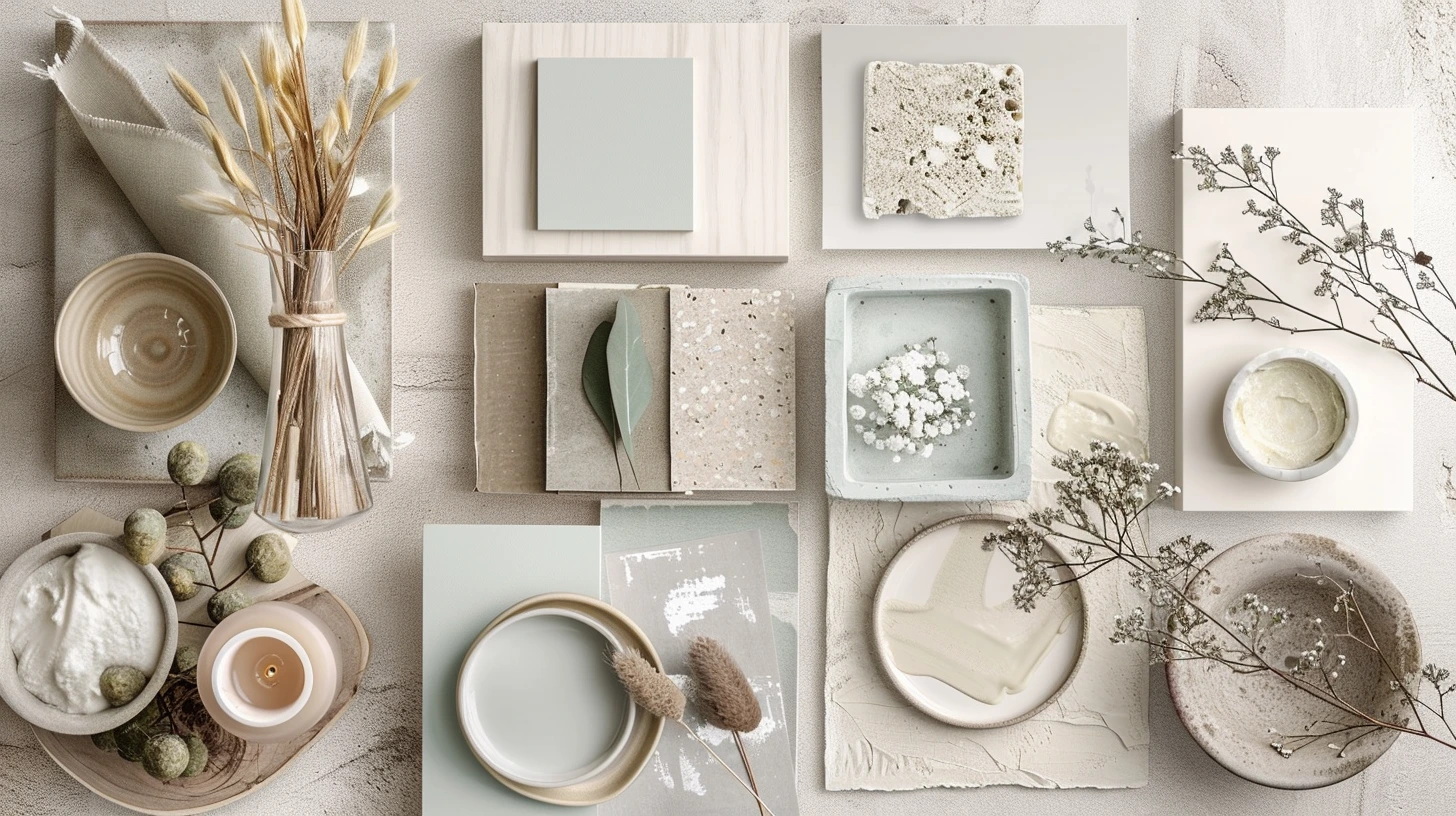
Warm white is not just white; it is the background that decides whether a room feels soft, creamy or dull.
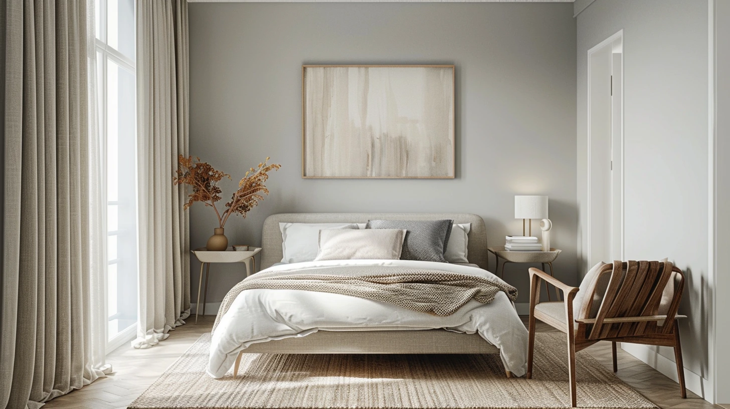
Small rooms need clarity more than whiteness; the right palette can create space, flow and calm.
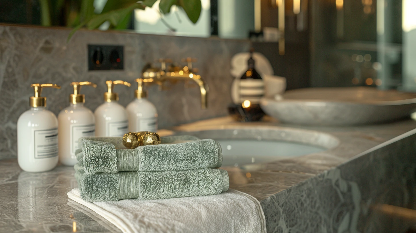
Bathrooms can carry more atmosphere than people expect, especially with stone, brass, white and muted colour.
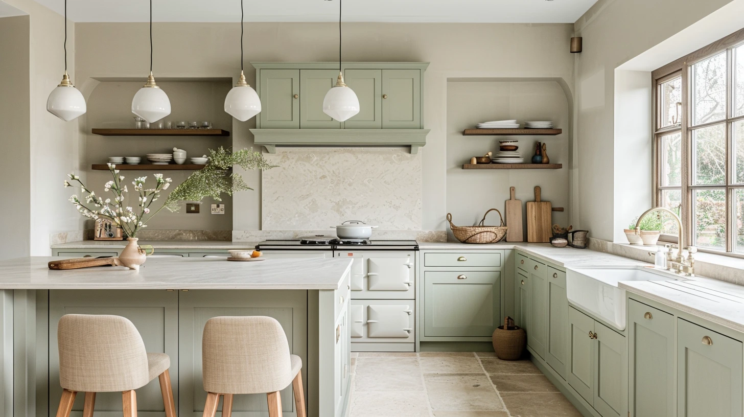
The best kitchen palettes balance practical neutrals with enough contrast to feel designed.
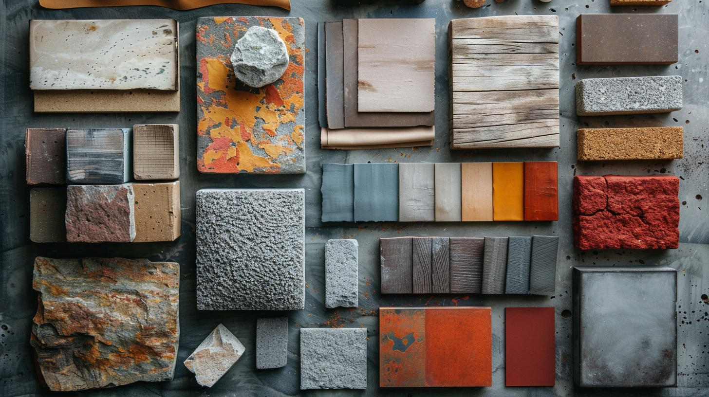
Use real materials as the starting point for colour palettes, with 10 combinations built around walnut, oak, travertine, steel, marble, terracotta, leather, chrome, cork and vel…
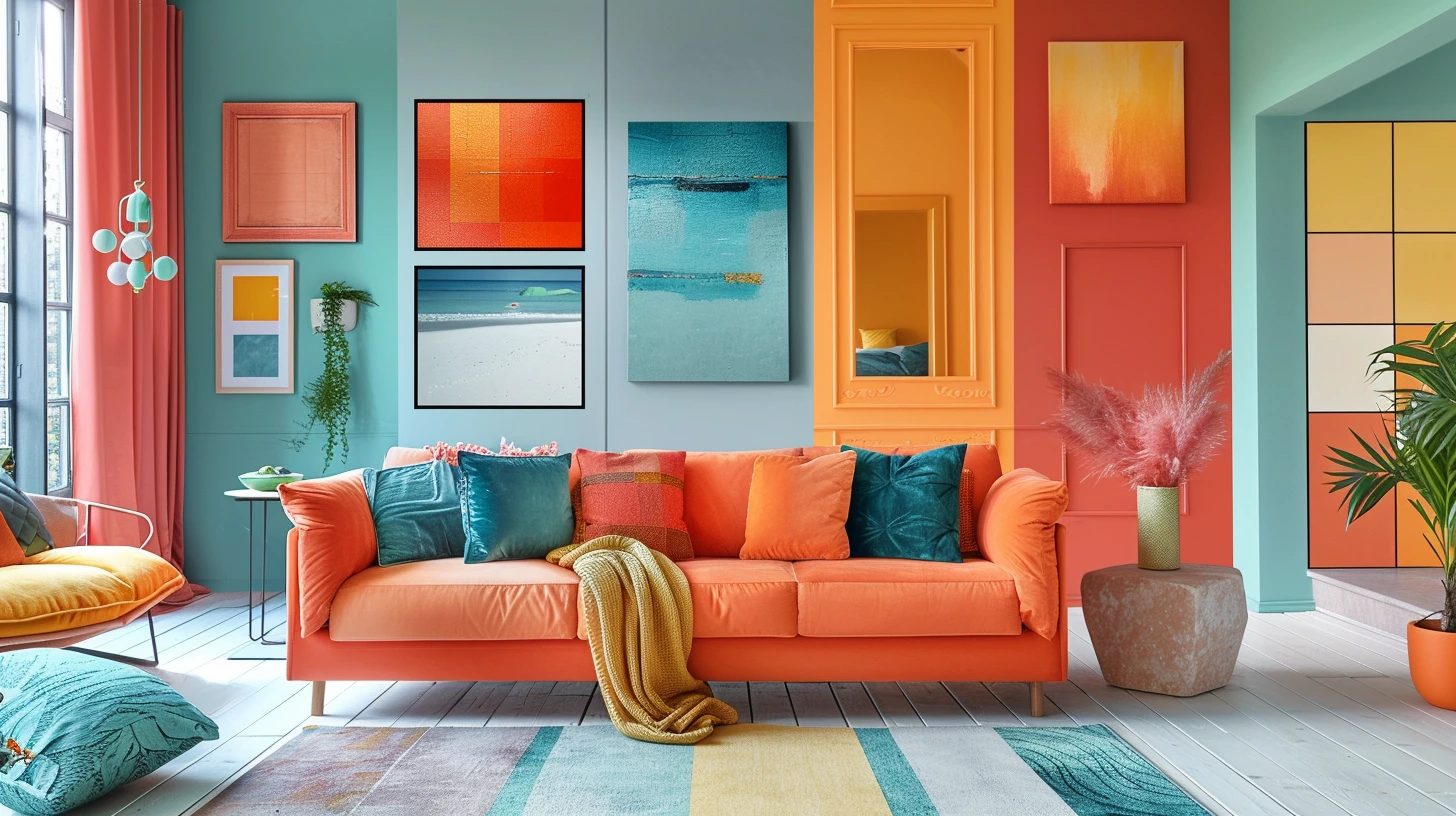
Choose colour palettes for north-facing and south-facing living rooms, small bedrooms, hallways, kitchens, bathrooms, home offices, nurseries and dining rooms.

Learn analogous, complementary, split-complementary, triadic, monochrome, saturation, undertones, tints, tones and shades using practical visual palettes.

Explore 10 palettes inspired by Bauhaus, Art Deco, Arts and Crafts, Impressionism, Renaissance fresco, Dutch Golden Age painting, Pop Art, mid-century design, Victorian botany a…
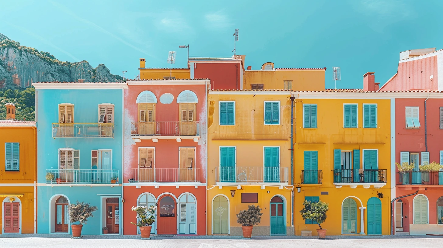
Explore colour palettes inspired by the Amalfi Coast, Iceland, Kyoto, Marrakech, the Scottish Highlands, Santorini, New England, the Alps, Namib and rainforest landscapes.
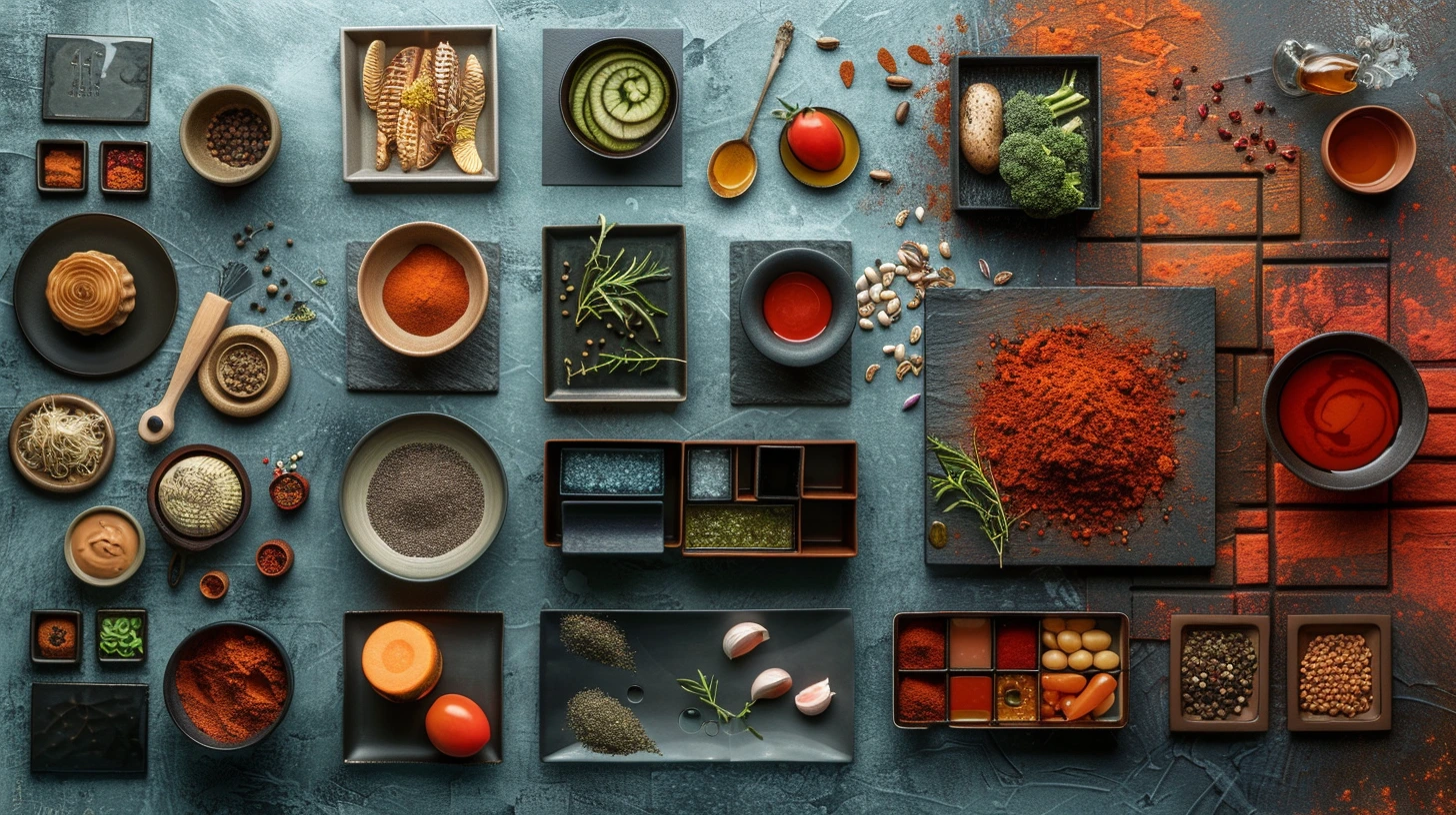
Explore 10 food and drink palettes for restaurants, cafés, bakeries, coffee roasters, wine bars, breweries, sushi, Mediterranean food and fresh juice brands.
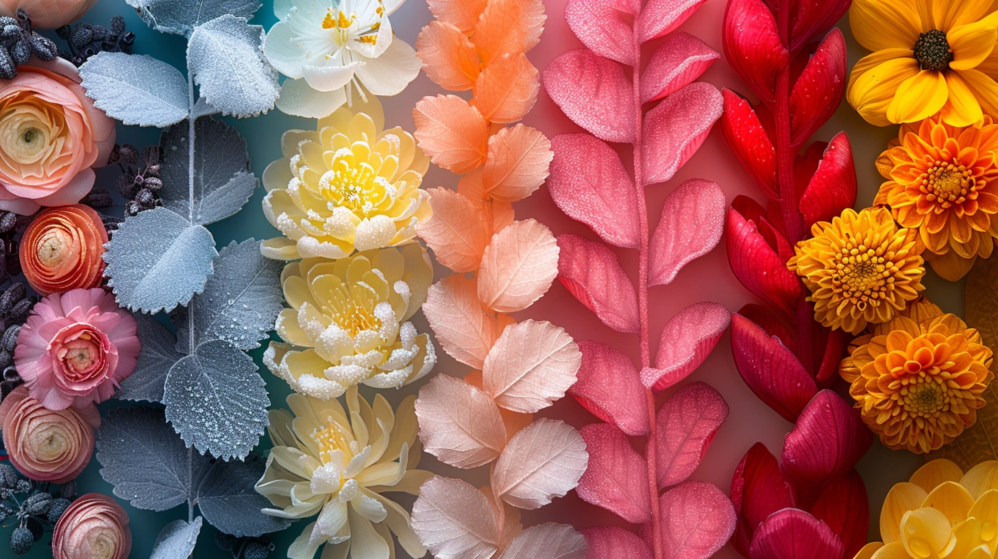
Use 10 seasonal colour palettes for spring launches, summer festivals, autumn campaigns, winter galas, New Year, Valentine’s, Easter, Halloween and celebrations.

Learn how to build accessible colour palettes with strong text contrast, clear actions and better status design, without reducing every interface to black and white.

Choose brand colours by personality and commercial intent, with 10 palettes for trusted, playful, premium, sustainable, technical, heritage and editorial brands.
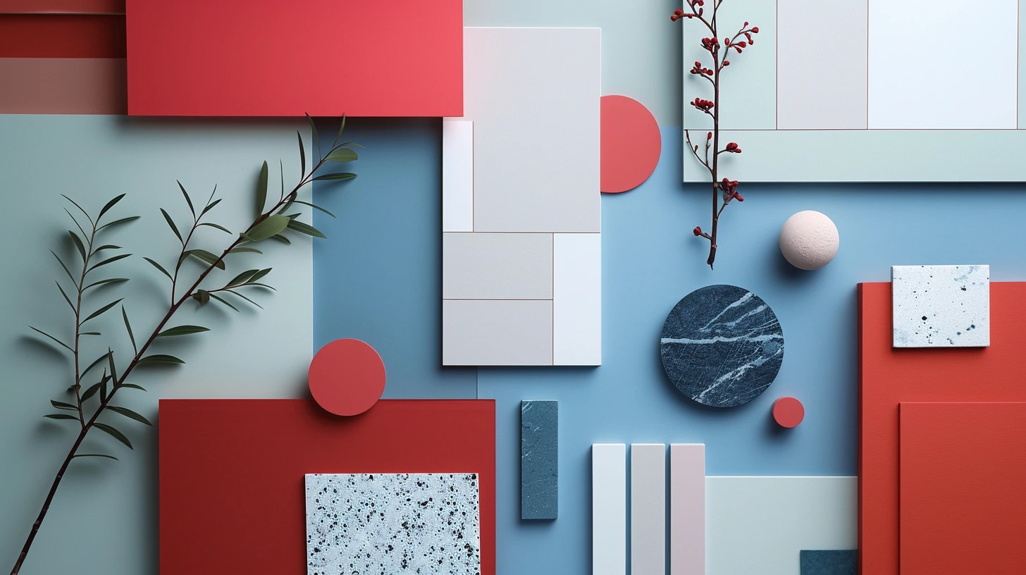
Explore 10 practical website colour palettes for SaaS, fintech, healthcare, ecommerce, AI products and accessible interfaces, with guidance on how to use each colour role.
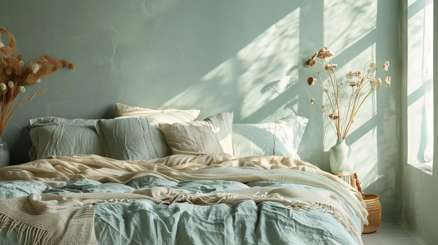
A bedroom palette should lower the volume of the room and make every finish feel deliberate.
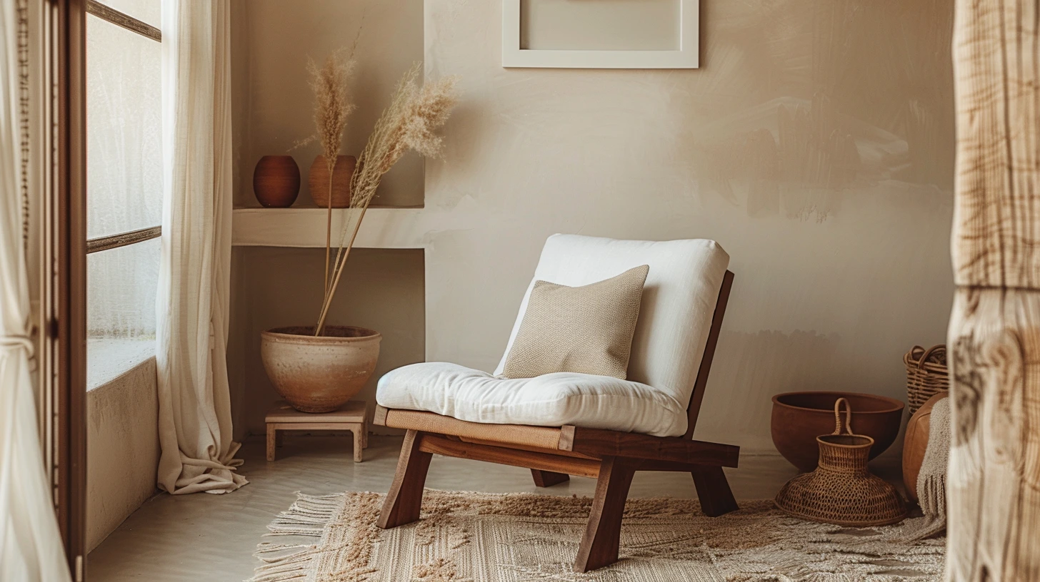
Terracotta brings warmth, craft and Mediterranean energy into a space, especially when paired with chalky neutrals.
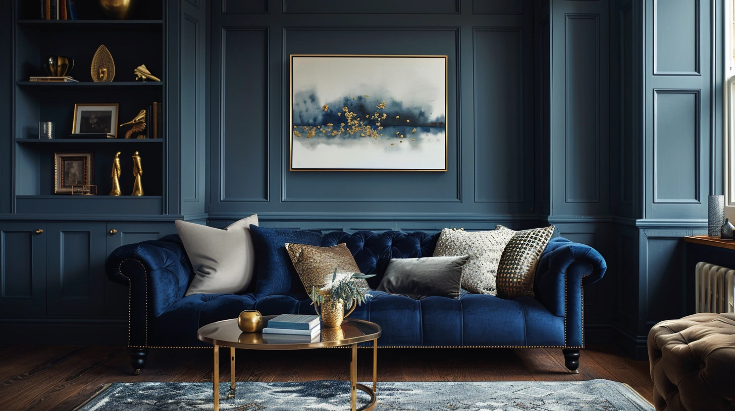
Navy can make a room feel tailored, deep and expensive, but it needs warm balance to avoid feeling flat.
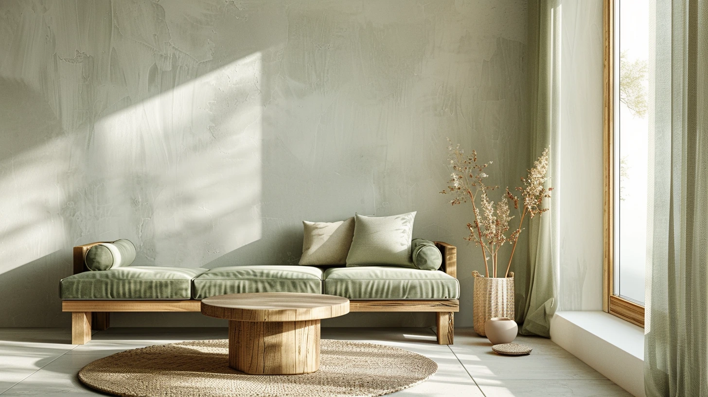
Sage green has become a modern decorating favourite because it feels fresh without being loud and calm without being cold.
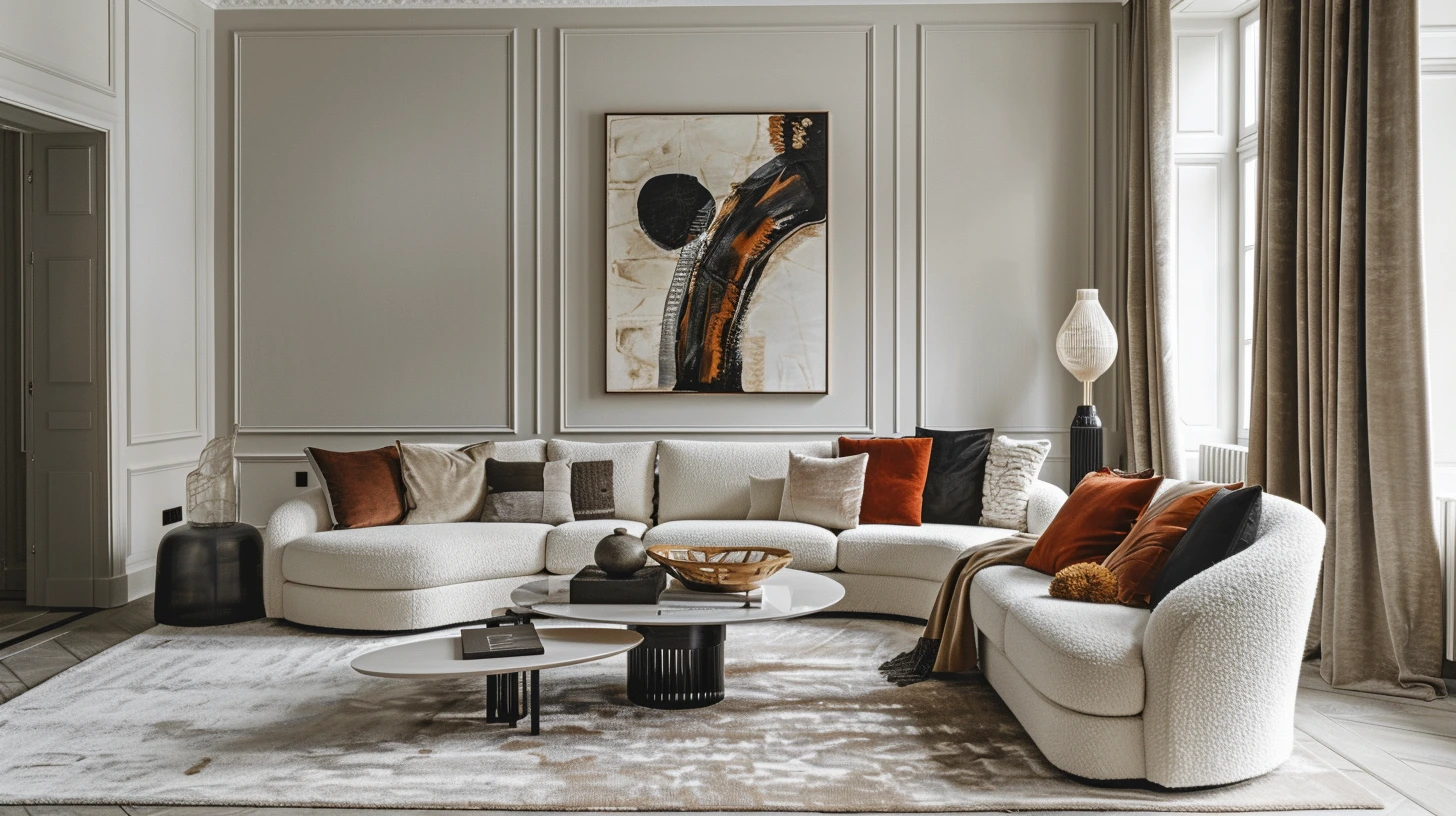
Living room colour works best when it has structure: a base, a bridge, an accent and a small moment of contrast.
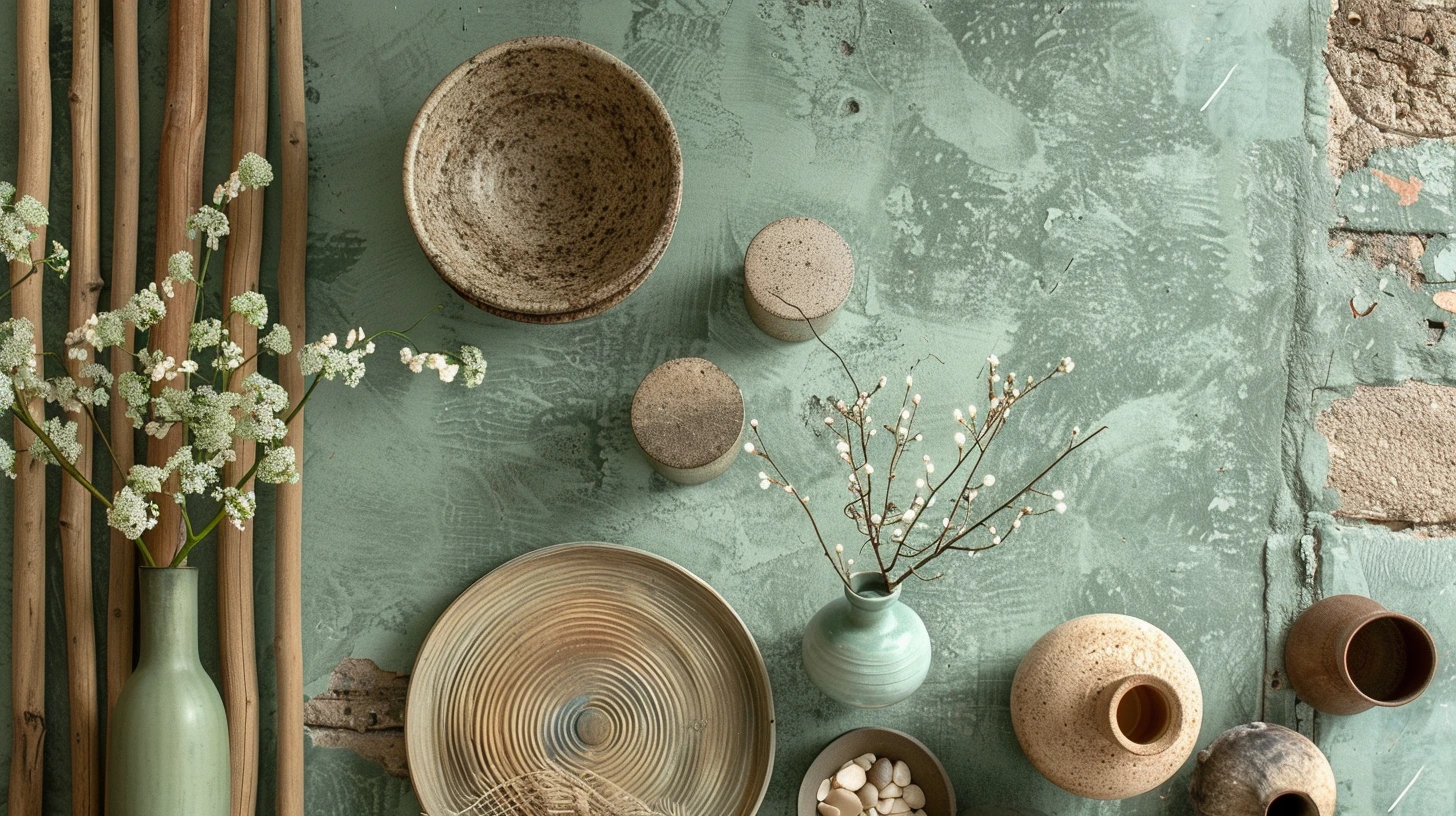
Article idea exploring forest, ocean, desert, garden and sunset-inspired colour palettes for interiors and creative projects.

Article idea helping small businesses choose brand colours for websites, logos, packaging and social media.
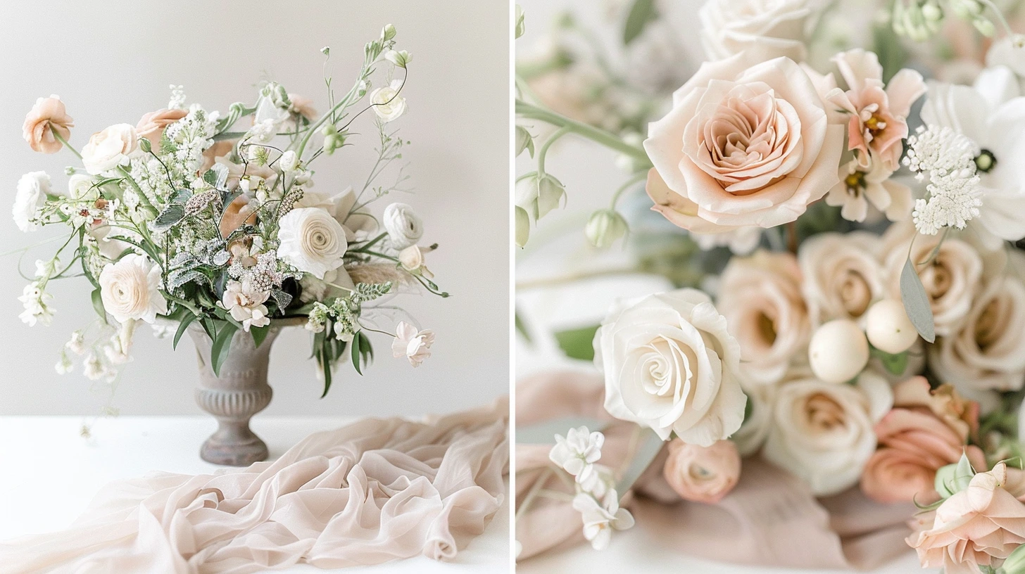
Article idea featuring elegant wedding colour schemes including blush, sage, champagne, navy, gold, ivory and terracotta.

Explore every 2026 World Cup country as a visual colour palette, with flag-inspired colour cards, hex codes and practical design notes.

Article idea covering terracotta colour combinations for interiors, fashion, branding and events.
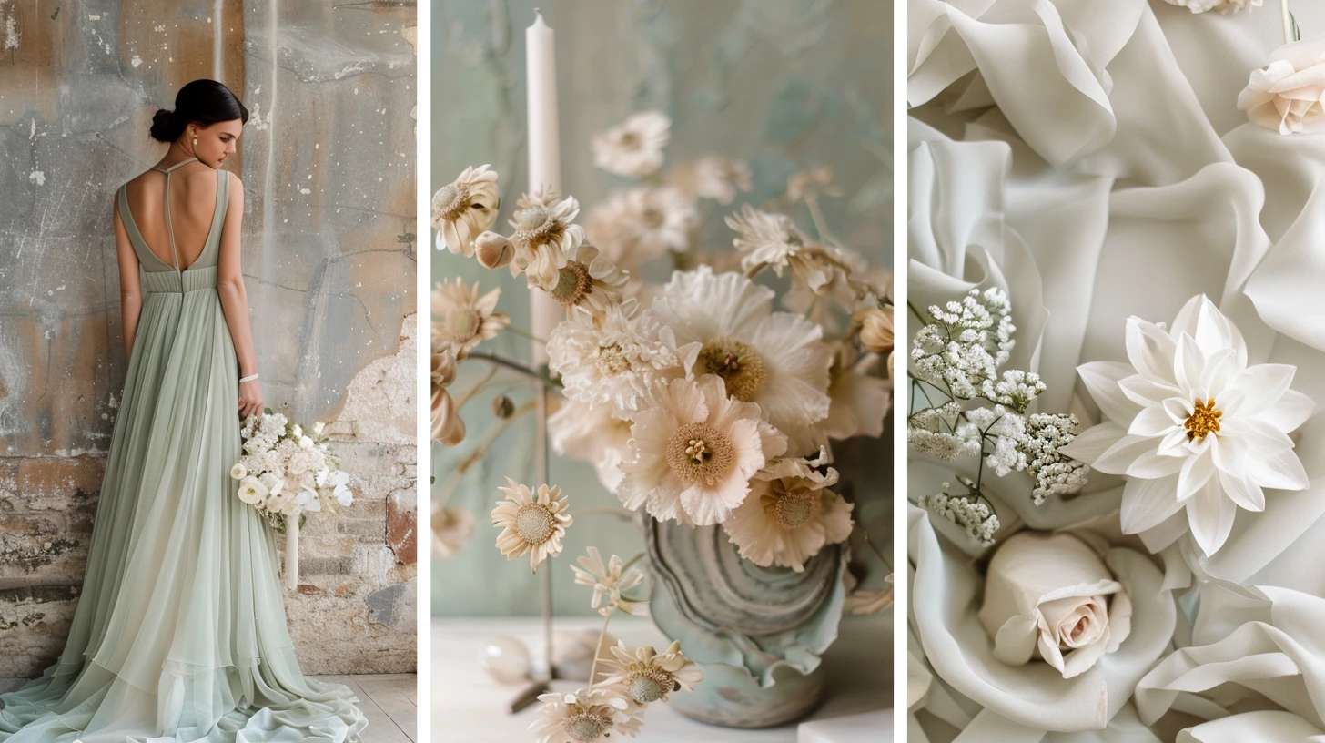
Article idea exploring how to use sage green across home decor, wedding styling and fashion colour palettes.

Explore colours that often feel expensive, refined and elegant in interiors and fashion, from camel and navy to ivory, burgundy, chocolate and deep green.
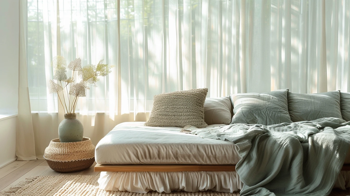
Discover calming colours for interiors, including soft green, muted blue, warm white, taupe, clay, lavender and gentle earth tones.

Explore the psychological meaning of colours, including blue, green, red, yellow, purple, black, white, pink, orange and brown.

Build a capsule wardrobe colour palette using versatile base colours, supporting neutrals and accent shades that work across seasons.

Learn simple outfit colour combinations that work, from navy and cream to camel and black, denim and white, burgundy and pink, and tonal neutrals.
Learn which colours can help a small room feel larger, brighter and more open, and when darker colours can work surprisingly well.
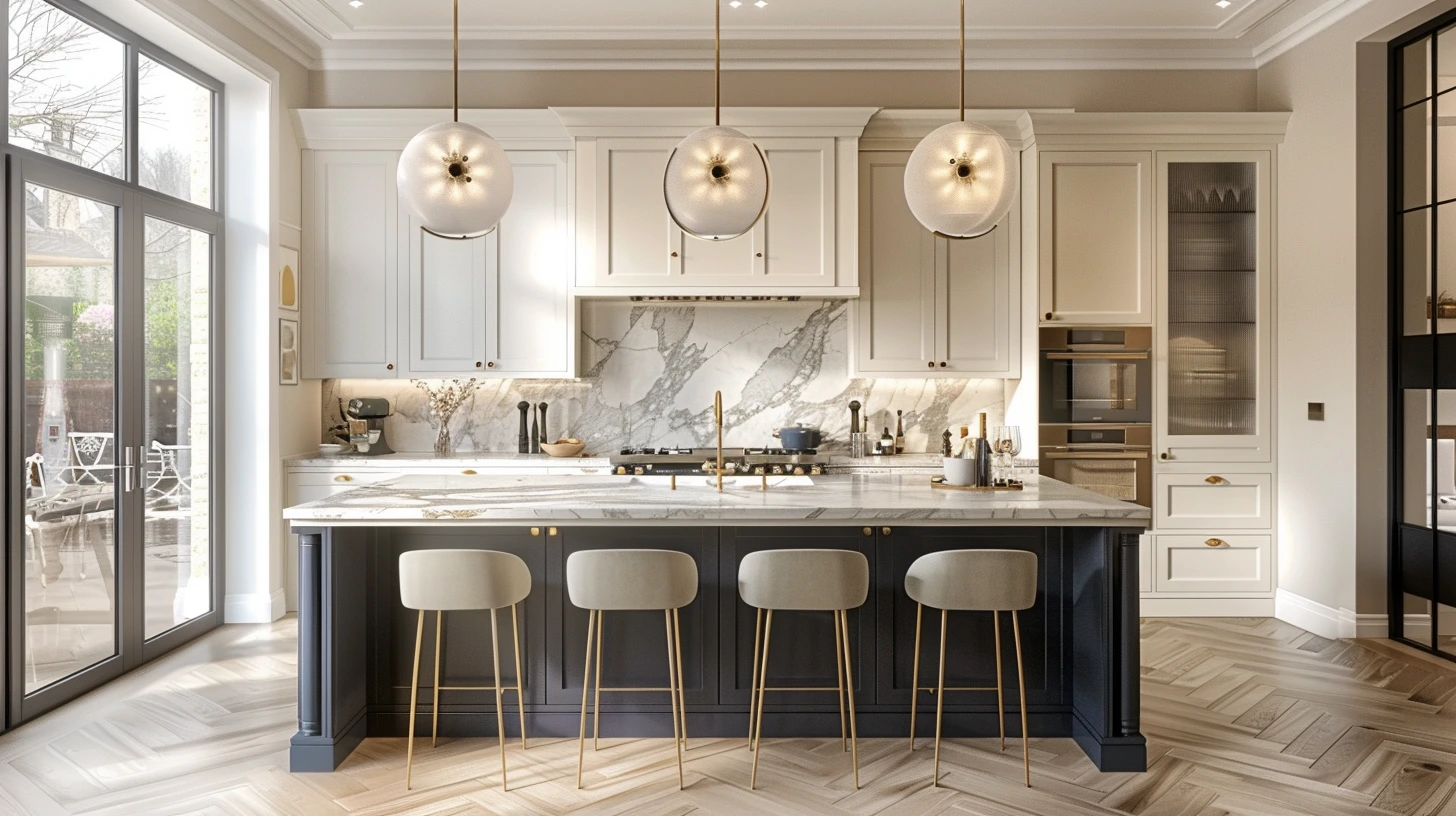
Explore kitchen colour combinations that feel timeless and stylish, including green and marble, navy and brass, warm white and oak, and black with natural stone.
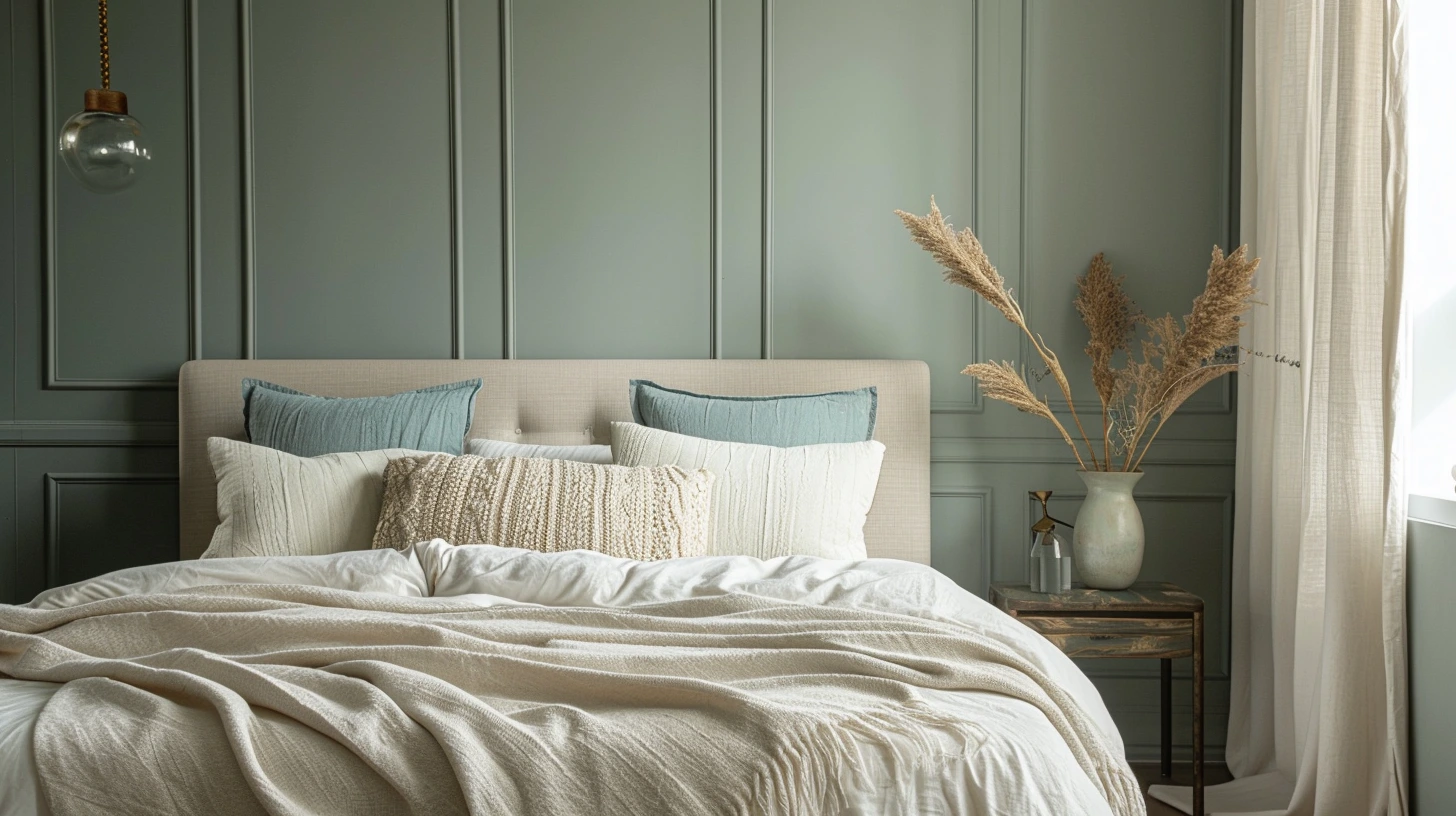
Create a more restful bedroom with calming colour combinations, from soft green and warm white to muted blue, taupe, plaster pink and gentle neutrals.
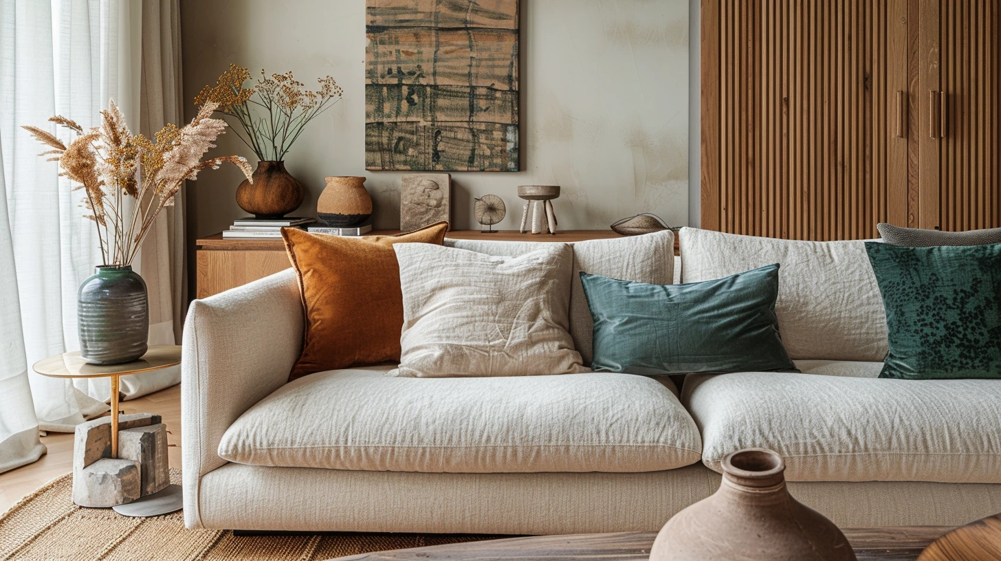
Explore living room colour palettes that feel comfortable, stylish and welcoming, from warm neutrals to deep greens, soft blues and earthy accents.
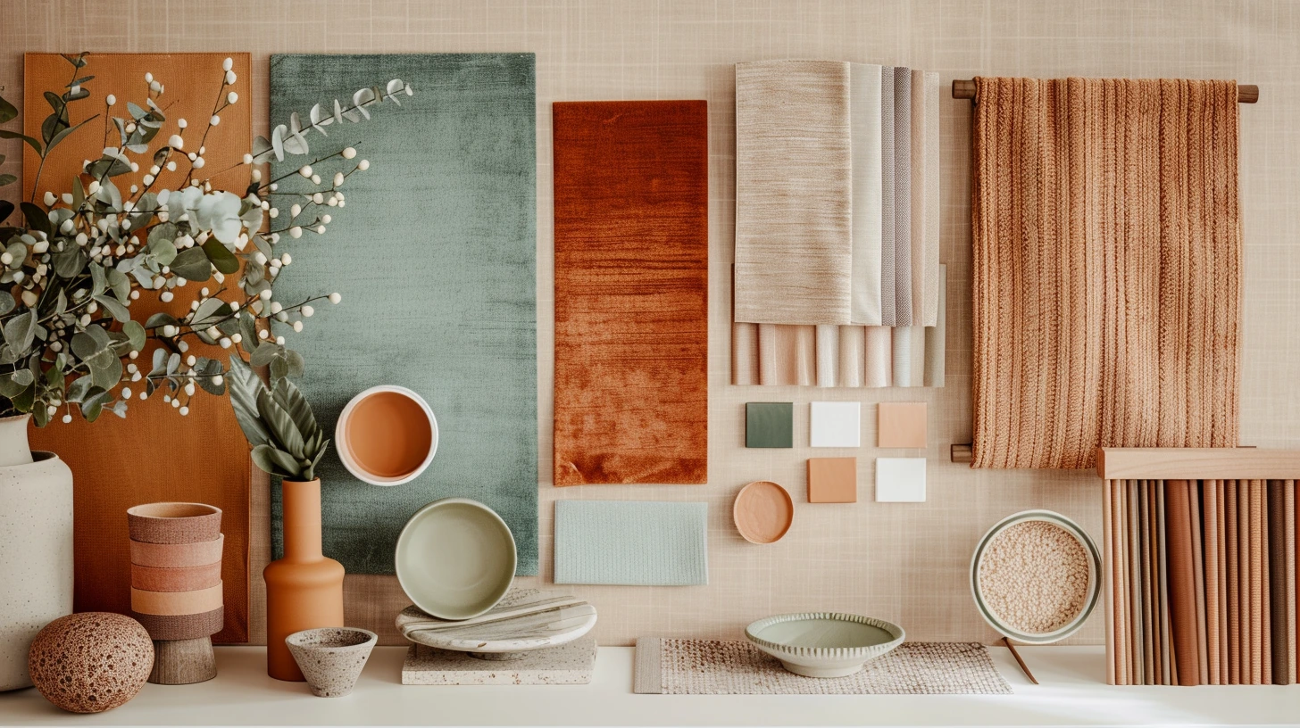
Learn how to choose interior colours that work beautifully together, from warm neutrals and earthy greens to navy, blush, terracotta and soft whites.