Copied
Colour Palettes

Burgundy Colour Palette

Burgundy colour palette ideas for interiors, fashion, branding, websites and creative projects.

Open the colour tool

About this palette

The Burgundy colour palette brings together a set of shades that can be used across interiors, fashion, branding, websites, presentations and creative projects. It gives you a starting point for understanding how this colour behaves alongside lighter neutrals, deeper accents and supporting tones.

Use this palette when you want a ready-made colour direction rather than starting from a blank canvas. The colours included are #800020, #991B1B, #F3C6C6, #2A0606, making it easy to copy the values into a design tool, CSS file, mood board or visual concept.

You can also explore related colour palettes, open the palette in the colour tool, or compare it with articles that use similar colour ideas.

Colours in this palette

Click any colour to copy the HEX value, or open the full palette in the colour tool to test harmonies, contrast and CSS export options.

Base colour
Supporting colour
Supporting colour
Supporting colour

How to use this palette

  • For interiors: use the lighter shades for walls or backgrounds, then bring in the deeper shades through furniture, artwork, textiles or smaller accents.
  • For websites: use the strongest colour as an accent, the lightest colour as a background and the darkest colour for readable text.
  • For branding: pick one dominant colour, one neutral and one contrast colour so the palette feels recognisable rather than crowded.

CSS colour variables

Copy these variables into your stylesheet or design system.

:root {
  --palette-colour-1: #800020;
  --palette-colour-2: #991B1B;
  --palette-colour-3: #F3C6C6;
  --palette-colour-4: #2A0606;
}

Similar colour palettes

These palettes share similar tags or colour ideas, so they are useful next steps if you want a related look.

Articles that explore similar colours

Read more colour stories, design guides and palette ideas that connect to this page.

Colours That Look Expensive in Interiors and Fashion colour palette inspiration
Colours That Look Expensive in Interiors and Fashion
Explore colours that often feel expensive, refined and elegant in interiors and fashion, from camel and navy to ivo…
4 min read · 1 Jun 2026

What Colours Go Well Together in Clothes? colour palette inspiration
What Colours Go Well Together in Clothes?
Learn simple outfit colour combinations that work, from navy and cream to camel and black, denim and white, burgund…
4 min read · 4 May 2026
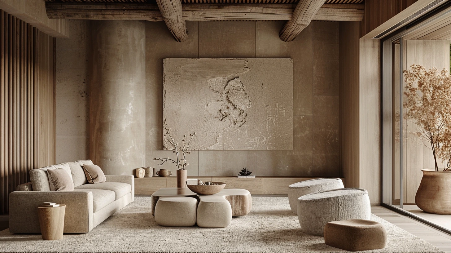
Greige Colour Palettes for Homes That Need Warmth and Balance colour palette inspiration
Greige Colour Palettes for Homes That Need Warmth and Balance
Greige works because it sits between grey and beige, giving a room softness without losing structure.
4 min read · 14 Sept 2026
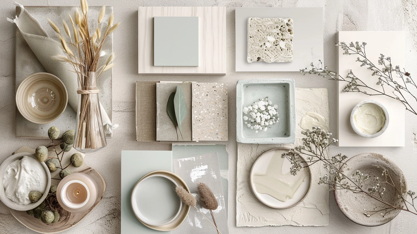
Warm White Paint Colours and What to Pair Them With colour palette inspiration
Warm White Paint Colours and What to Pair Them With
Warm white is not just white; it is the background that decides whether a room feels soft, creamy or dull.
4 min read · 7 Sept 2026
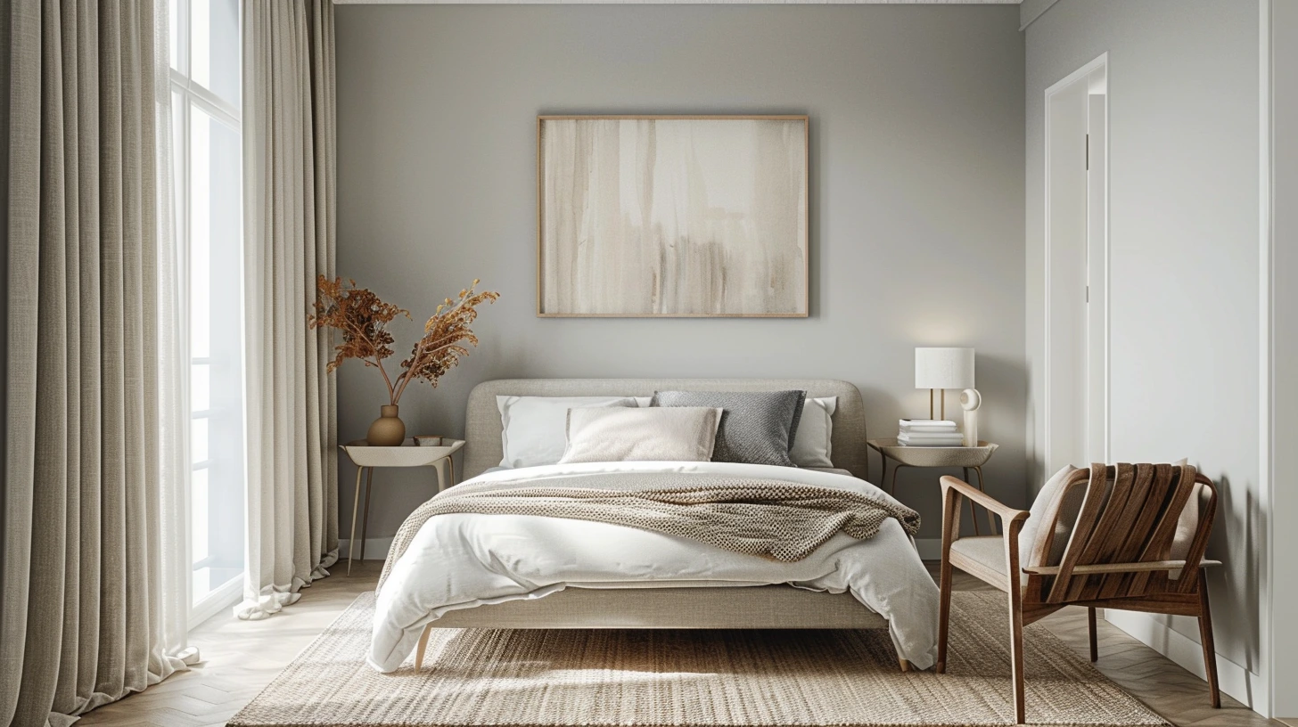
Small Room Colour Ideas That Make a Space Feel Bigger colour palette inspiration
Small Room Colour Ideas That Make a Space Feel Bigger
Small rooms need clarity more than whiteness; the right palette can create space, flow and calm.
4 min read · 31 Aug 2026
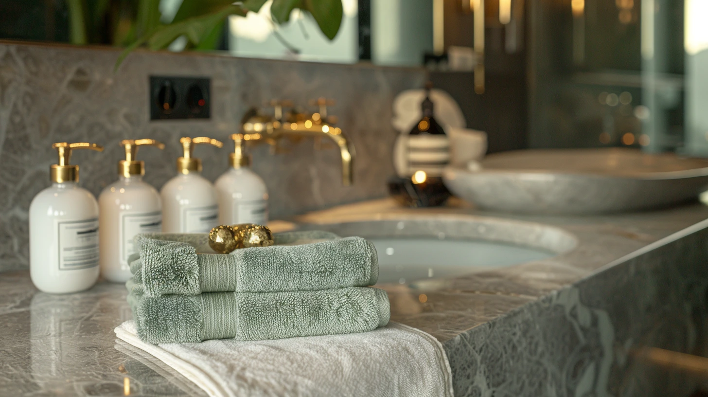
Bathroom Colour Palettes That Feel Like a Boutique Hotel colour palette inspiration
Bathroom Colour Palettes That Feel Like a Boutique Hotel
Bathrooms can carry more atmosphere than people expect, especially with stone, brass, white and muted colour.
4 min read · 24 Aug 2026

Explore more colour directions

Move beyond this palette and browse other live Palette Burst categories, using real colours from the database rather than a generic placeholder strip.