Copied
Common Interior Palettes

Japandi Oak Bedroom Colour Palette

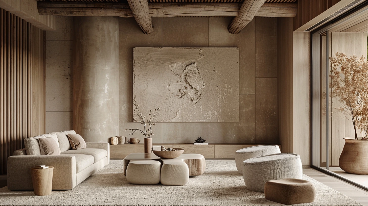
Japandi Oak Bedroom interior colour palette for room schemes, decorating ideas and home mood boards.

Open the colour tool

About this palette

The Japandi Oak Bedroom palette is designed for room schemes, decorating ideas and home mood boards. It combines base tones, accent colours and contrast shades to help create a more considered interior colour direction.

This palette works especially well for themes such as interior, bedroom, japandi, oak. The included colours are #F5F0E8, #D6C6B8, #8A7A68, #2F3430, #FFFFFF.

You can also explore related common interior palettes, open the palette in the colour tool, or compare it with articles that use similar colour ideas.

Colours in this palette

Click any colour to copy the HEX value, or open the full palette in the colour tool to test harmonies, contrast and CSS export options.

Base colour
Supporting colour
Supporting colour
Supporting colour
Supporting colour

How to use this palette

  • For walls: use the softer or lighter tones as the main wall colour, especially in smaller rooms or rooms with limited natural light.
  • For accents: use the richer shades on furniture, cabinetry, cushions, artwork, rugs or feature walls.
  • For balance: repeat at least one colour in more than one place so the room feels intentional.

CSS colour variables

Copy these variables into your stylesheet or design system.

:root {
  --palette-colour-1: #F5F0E8;
  --palette-colour-2: #D6C6B8;
  --palette-colour-3: #8A7A68;
  --palette-colour-4: #2F3430;
  --palette-colour-5: #FFFFFF;
}

Similar colour palettes

These palettes share similar tags or colour ideas, so they are useful next steps if you want a related look.

Articles that explore similar colours

Read more colour stories, design guides and palette ideas that connect to this page.

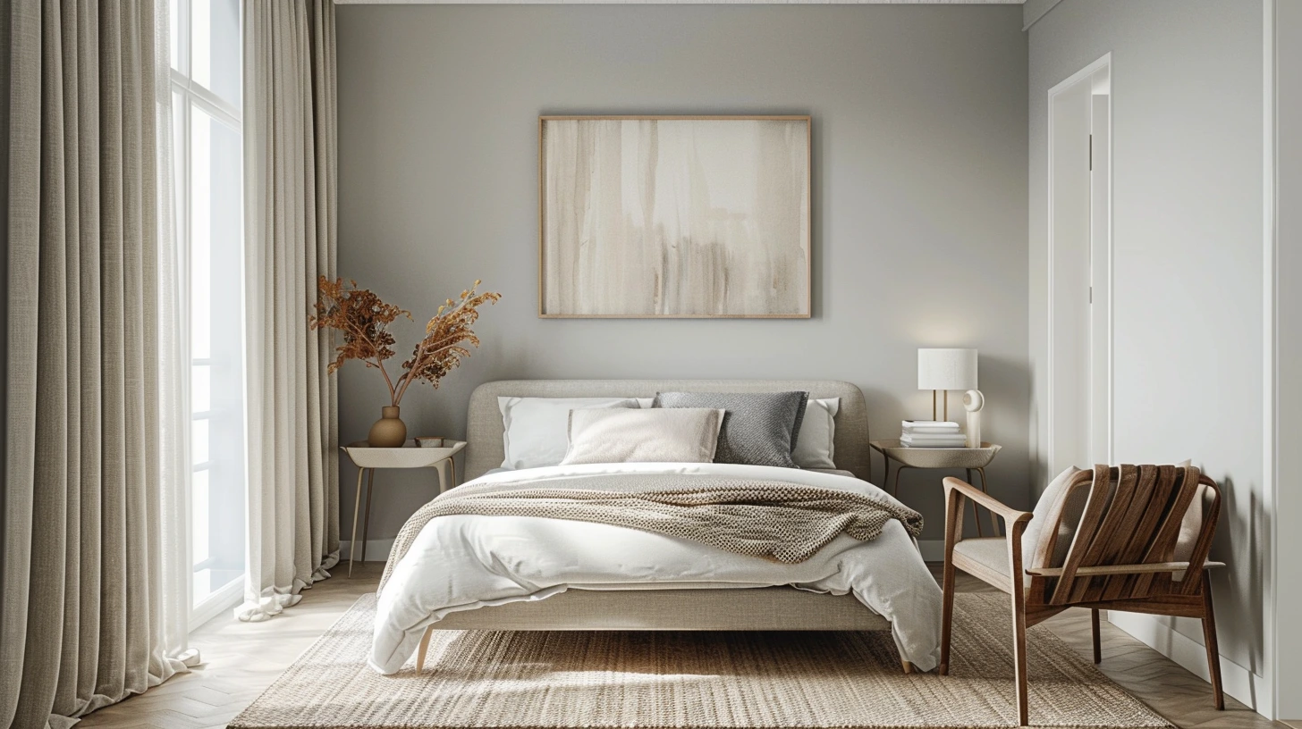
Greige Colour Palettes for Homes That Need Warmth and Balance colour palette inspiration
Greige Colour Palettes for Homes That Need Warmth and Balance
Greige works because it sits between grey and beige, giving a room softness without losing structure.
4 min read · 14 Sept 2026
Warm White Paint Colours and What to Pair Them With colour palette inspiration
Warm White Paint Colours and What to Pair Them With
Warm white is not just white; it is the background that decides whether a room feels soft, creamy or dull.
4 min read · 7 Sept 2026
Small Room Colour Ideas That Make a Space Feel Bigger colour palette inspiration
Small Room Colour Ideas That Make a Space Feel Bigger
Small rooms need clarity more than whiteness; the right palette can create space, flow and calm.
4 min read · 31 Aug 2026
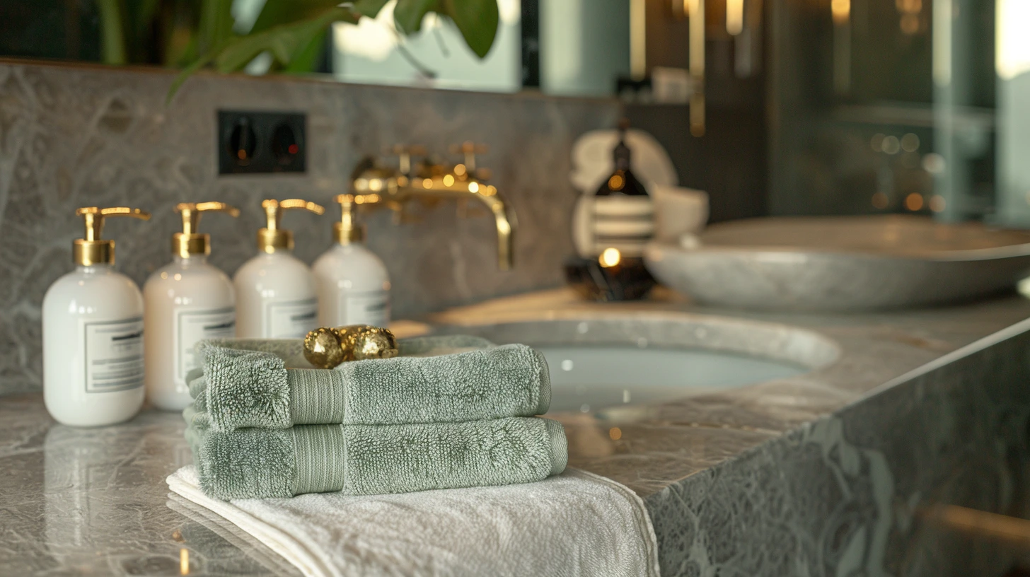
Bathroom Colour Palettes That Feel Like a Boutique Hotel colour palette inspiration
Bathroom Colour Palettes That Feel Like a Boutique Hotel
Bathrooms can carry more atmosphere than people expect, especially with stone, brass, white and muted colour.
4 min read · 24 Aug 2026
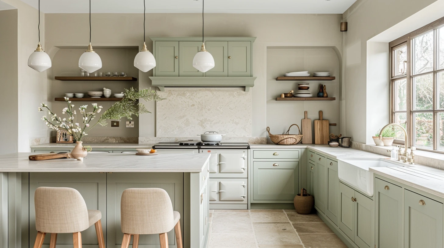
Kitchen Colour Combinations That Look Fresh for Years colour palette inspiration
Kitchen Colour Combinations That Look Fresh for Years
The best kitchen palettes balance practical neutrals with enough contrast to feel designed.
4 min read · 17 Aug 2026
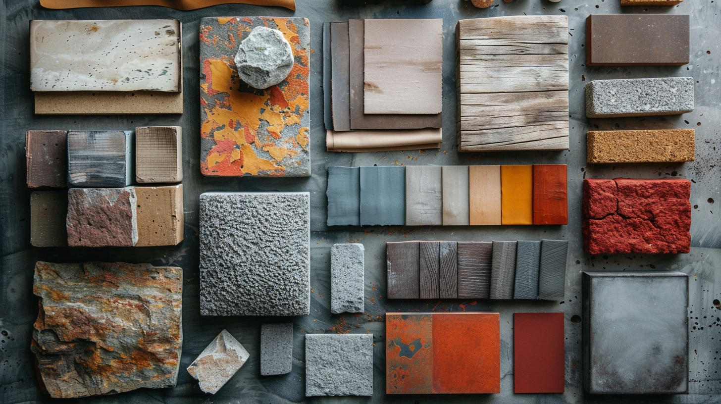
How to Build a Colour Palette from Wood, Stone, Metal and Fabric
Use real materials as the starting point for colour palettes, with 10 combinations built around walnut, oak, traver…
3 min read · 14 Aug 2026

Explore more colour directions

Move beyond this palette and browse other live Palette Burst categories, using real colours from the database rather than a generic placeholder strip.